Hydration bottle design and merchandising involving graphic art and layout, printed wrap card, and product photography. The goal in every product marketing is to maximize the resources available. Many of the packaging photography was created to be re-purposed for email and online marketing.
The printed transparent substrate on a clear soap bottle gives the illusion of the elements floating inside. Also shown are various options on layout and font use.
Nautica product and catalog design
Product development catalog for Nine West.
Design concepts for Hydrance hand cream with an intense hydrating formula, Mér body wash, and UltraShimmer foundation powder landing page design, which mirrors catalog cover.
Holiday gift set options that shine with metallic, UV and iridescent gel prints.
Hydration gift box design
Some web design projects are more involved than others. The two shown examples are of photography-based portfolio site (anapiore.com), and graphic element-heavy family entertainment complex site (edisonsfun.com). The latter was an existing site to which was redesigned using WordPress.
Juicy Couture design direction and presentation deck.
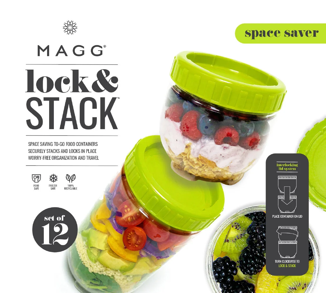
Stackable label design is a consumer-engaging concept where I wanted the label to speak to its reader, the customer directly. I think the typography and layout speak modern while embracing some old-school vibes. Think milk crates reinvented.
The home organization has been in the upswing, thanks to the popularity of HGTV and the like. I have explored numerous materials from acrylic and MDF to Acacia wood. This project required heavy photography with prop and location.
Display of print designs and presentation concepts:
Printed hydration bottles, acrylic organizer with black paisley print base, Magg hangtag concepts, bamboo merch collection design for Ani DiFranco, Orange County Choppers graphic t-shirt collection, Smart & Sexy trend forecast, and brand marketing concept.
Iconix spearheaded this rebranding (refresh) project wherein I was able to redesign the brand packaging concept and apply the look across various categories. The two overlapping hanger card design went into production and lived briefly before transitioning to the new look, and the last is my favorite that did not make the cut.
It can be tricky to interpret a client’s idea into a successful design. The EZ logo was given to me as a rough idea, which had to be refined over time. Overall, I think it’s a fresh and clean look for a new mop brand.
This was one of the very first packagings I designed where the product’s feature was on top of the hierarchy. The energy-saving feature is utility-related; hence, the color scheme and infographics are detailing product benefits. There were various sizes and colors which were swapped using the same layout, with minor adjustments on spec and product name.
I have worked on many branded displays for mass-market consumption. These are the two most recent. The cosmetic organizer display was for large chains, including pharmacies and grocery stores. The FLEX project was a B2B shipper container design for an existing product line.
Acrylic picture frame insert designs showing two concepts: One with soft and ethereal paint blur; the other with an inverted floral photography theme with a film negative treatment.
The most exciting part of the design process is exploration. Trend research and direction are created to narrow down the myriad of ideas into a more manageable size. With apparent visual reference and color direction, a successful product line becomes easier to realize.
A packaging design concept based on wire metal baskets poses challenges in application and placement due to a variety of shapes and sizes. I always attempt to give the client options, but my heart belongs to dark and rich tags with the shiny copper print that pop on store shelves.
The breadth of the CosmoLiving brand knows no bounds. Finding ways to introduce kitchen gadgets and various household items, unrelated to beauty and fashion, was a fun challenge I simply resolved to file under the “health” category of the brand’s missions. Sneaky me!
Yoga mat packaging design and an event flyer for a yoga studio.
Bathroom products made of metals require more substantial-quality material that will withstand the product and wear from handling. Also shown here are some pages from the marketing catalogs.
Branding design and packaging for a new intimates brand, Nuance; fresh hanger card concept for Simply Basic; panty box set for Smart & Sexy; 3pk lace panty set for NOBO (No Boundaries); and an intimates company brochure.
Finding the right product name can be a challenge, but when you can create and trademark an excellent working product, it’s a win-win.
Some products call for a simple design where you let the products in hand speak for themselves.
Clear acrylic is so appealing for its versatility, durability, and beauty. It is a challenge, however, capturing its assets in a photo for marketing and packaging, highlighting its clarity while making it blend into the background—fit for any décor.
This is as simple as it gets. The client wanted a plain black hang tag with the logo on quality stock. No Problem!
Subway poster concept design for Vince Camuto.
Some pages from a presentation I created to attract more projects like this. I like the clean and modern take on what’s typically a dated PowerPoint slide show riddled with bullet points. None can be found here, thankfully.
Drink menu design for a family entertainment complex. I sketched out the initial concepts and handed them off to the company to complete production, as per their protocol.